Project Description
in HK Magazine
2013
Graphic Design
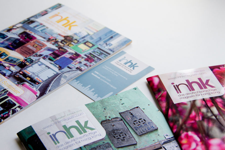
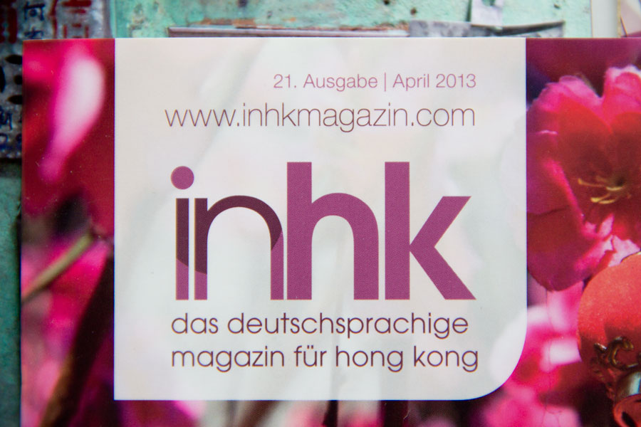
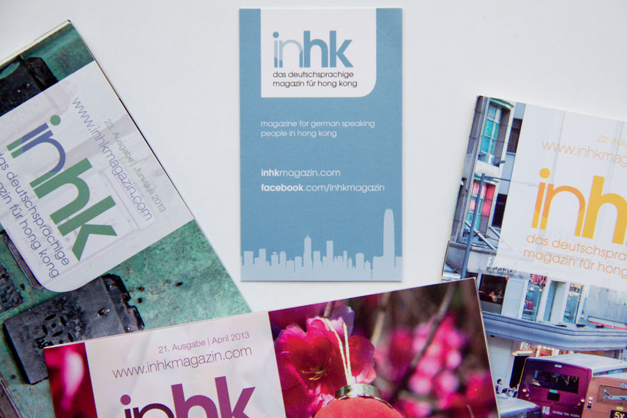
inHK gets a new emblem. The existing design is revamped with a new look for its logo that is featured on the magazine. The new design uses a fresher, lighter font. The new logo emphasises on the «in» part of its words. The circle encompasses visually but also literally the meaning of being in-side of Hong Kong as the monthly magazine provides inside news and information for the German speaking community of Hong Kong
The logo can adapt to different colours to match each month’s cover. At the same time the colour becomes the main theme colour for each edition.
The new logo is placed on an emblem of transparent white so the feature image of the cover can be still seen through at the same time it allows to highlight the monthly magazine information. The magazine’s cover design highlights now prominently the emblem and three headlines of its content.
Client: in HK Magazine
