Project Description
Graphic Design
Laiyan is the commercial platform for creative services launched by the German artist and company founder Cornelia Erdmann.
Erdmann was chosen as the company’s name to reflect the close and artistic relationship between the art and design practice of its founder. Erd-mann means earth-man or man from the earth in German. lai-yan is its Cantonese counterpart.
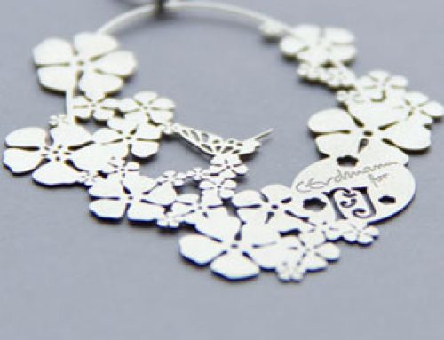
The company’s logo is coined by the graphics of its chop, a Chinese seal engraving, designed by Sum Wing-Man, that brings the Western name into its realm of action in Hong Kong and Asia.
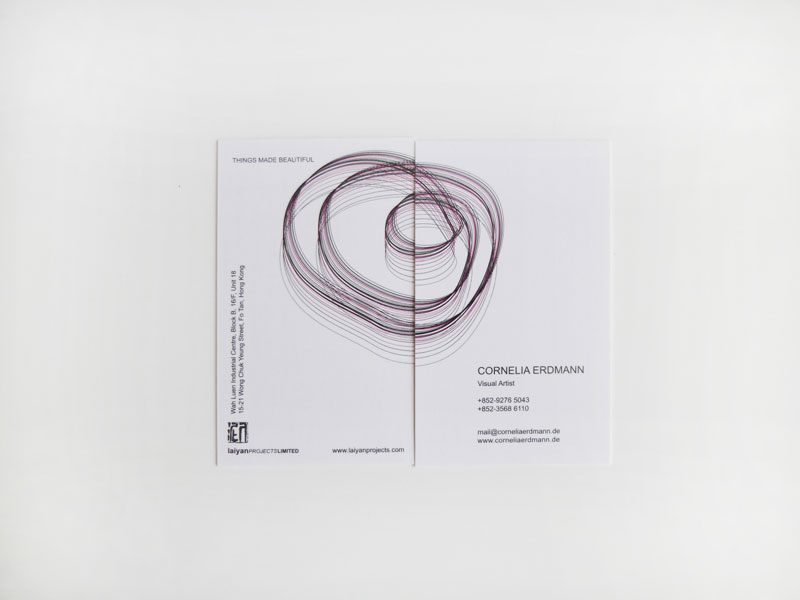
Black and white dominate the design to continue the image of printing and black ink used such as design sketches, classical Chinese printmaking and representation of sharp lines, yin and yang.
The only other colour added is a warm and deep raspberry pink that found its origin in the space, the company works in. The studio space is a serene white design space with a few architectural elements highlighted in this pink colour.
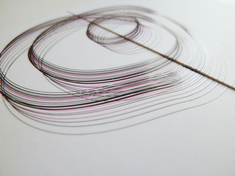
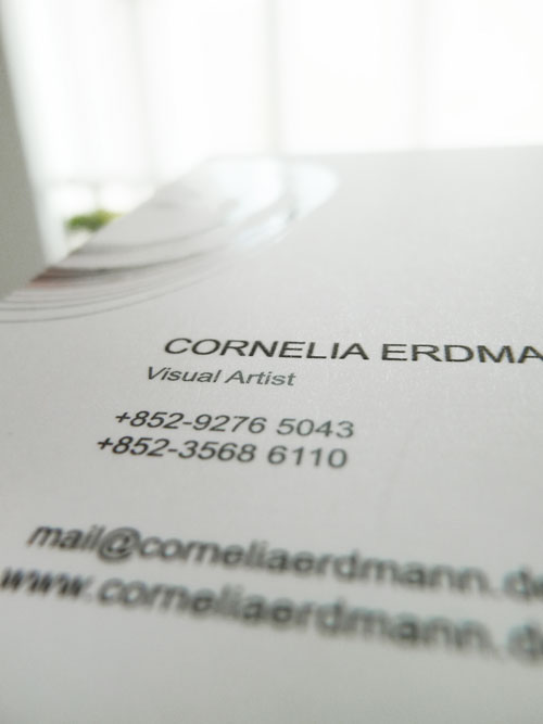
lain Projects’ and Cornelia Erdmann’s new name card are one and the same, but each side with a distinct look, yet both sides form a unit hold together by a circular graphic that is split into halves – on each side one. One side stands for the artistic side of the company’s founder the other side represents the commercial design orientation, each side can stand on its own, but together they form the whole picture.
