Project Description
Graphic Design
Corporate Design
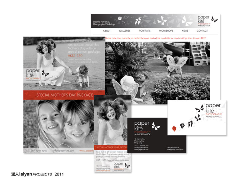
Logo and Business Cards
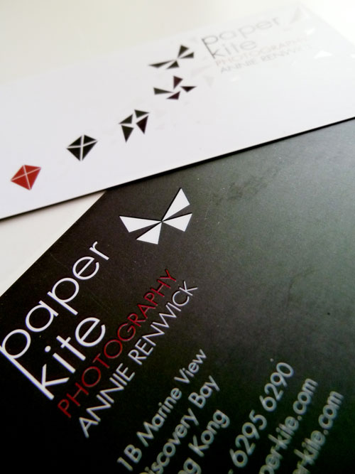
This client is a photographer specializing in lifestyle portraits. She wanted to develop her previous logo from a drawn butterfly with Chinese ink and chop style logo to something more contemporary but keeping the butterfly as a symbol to keep her business in line with her story.
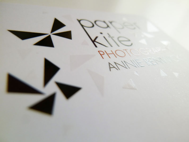
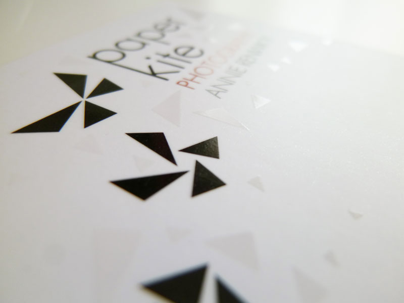
The paper kite is a butterfly but can be a paper kite at the same time. The new logo combines the two meanings in a little playful story where an abstract paper kite transforms into a butterfly – reflecting the client’s playful and unique, but at the same time sophisticated approach to her work. The new logo consists out of the abstract butterfly combined with a slim and elegant word mark of the client’s name and highlighted profession.
